

E-commerce is crucial for achieving success in online retail, and your e-commerce product pages are a defining feature that can determine your outcomes. They are the digital storefronts where visitors become buyers and long-lasting customers.
This article will explore 17 product page examples to convert site visitors into customers. It also reveals five best practices to improve your pages. Read on to learn more and grow your business!
Create High-Converting Product Pages With the Best Website Builders
| Provider | User Rating | Recommended For | |
|---|---|---|---|
| 4.6 | Beginners | Visit Hostinger | |
| 4.4 | Pricing | Visit IONOS | |
| 4.2 | Design | Visit Squarespace |
17 E-commerce Product Page Examples
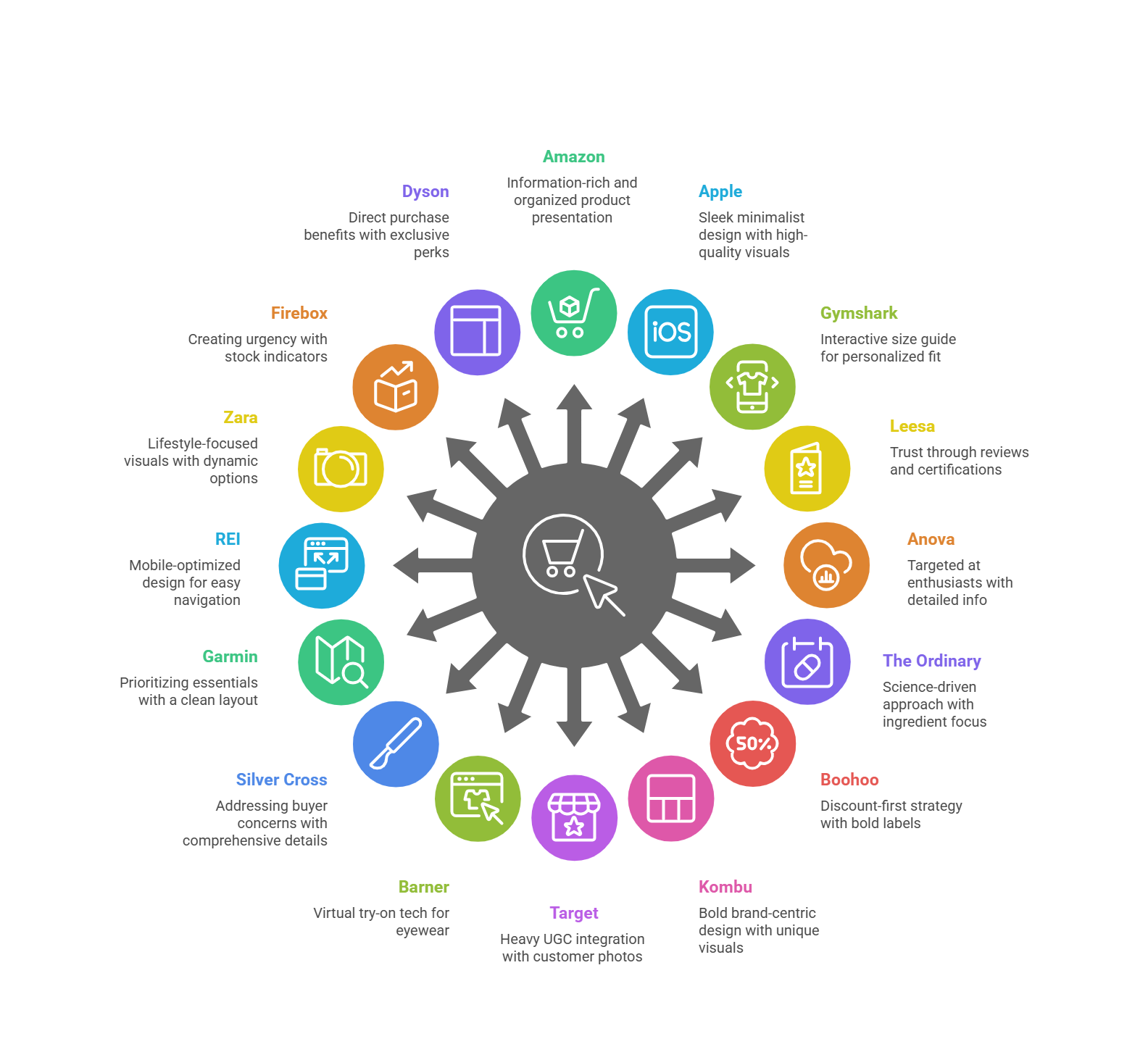
The rise in online shoppers has pushed businesses to add e-commerce product pages to boost sales. These product pages aren’t just pretty – they’re conversion machines. Here are some top-notch e-commerce product pages that excel in real life.
1. Amazon: Comprehensive Information

Amazon, an e-commerce giant, has perfected the art of information-rich product pages. They’ve balanced giving details with not overwhelming the site visitors. How do they do it?
First, Amazon has a clean, organized layout. It guides you to the most important information. The product title is descriptive and keyword-rich. This helps both customers and search engines understand what’s on offer.
But Amazon shines in its use of tabs and expandable sections. These sections contain everything from basic product details to specs, positive reviews, and Q&As.
Also, their comparison table feature is particularly clever. It allows you to see how the product stacks up against similar items. This makes it easier to choose the right item for your needs. In the end, it increases customer satisfaction and reduces the likelihood of returns.
In addition, Amazon leverages its vast user base to provide social proof. The review section isn’t just a star rating—it’s a goldmine of information. Customers can sort reviews by feature ratings, top positive reviews, or verified purchases.
2. Apple: Sleek and Minimalist Design

Apple takes a “less is more” approach to product page design. Their website is among the best product page examples in a minimalist design that is informative and compelling. And trust me, it works beautifully.
The first thing you’ll notice on an Apple product page is the generous use of white (or black) space. Surprisingly, this isn’t just about looking clean and modern. It directs the user’s focus to what matters most: the product itself.
Apple uses high-resolution photos and videos that showcase its products from every angle. More often, it uses smooth animated images that bring the features to life. This visually appealing approach plays to Apple’s strength. Again, it makes its products speak for themselves.
Nevertheless, Apple cleverly uses expandable sections to pack all the technical details. They also effectively use comparison tools to help customers understand the differences between models.
One of Apple’s strongest suits is its handling of product customization. The process is completely intuitive and visually appealing, based on your desires. As you make selections, the main image updates in time, giving you a clear view of your choices.
3. Gymshark: Interactive Size Guide

Gymshark, a fitness apparel brand, offers an interactive size guide to its online shopping experience. The tool takes into account the customer’s height, weight, and fit preferences.
Gymshark’s interactive size guide works better than just providing a static size chart. This personalized approach significantly reduces the guesswork in the online shopping experience.
But Gymshark doesn’t stop there. They provide multiple product images of each product, often showing it on different body types, to help customers visualize how the item might look on them.
Also, video content is a key element of Gymshark’s product page. These aren’t just static model shots. They show the clothing in action, demonstrating how it moves and performs during a workout. This is crucial for fitness wear, where functionality is as important as style.
Gymshark also effectively leverages user-generated content. They encourage customers’ feedback about themselves in Gymshark gear, which serves as social proof to potential customers.
4. Leesa: Building Trust with Reviews

Leesa is an online mattress retailer that sells what customers want to try before buying. The website’s approach is to build trust through customer reviews and ratings.
When you visit the Leesa product page, you’ll see their mattress’s overall star rating and reviews. This immediately establishes credibility and encourages further exploration.
But Leesa goes beyond just displaying an average rating. They break down reviews by attributes like comfort, quality, and value for money. Furthermore, Leesa prominently displays any awards or certifications their mattresses have received.
Leesa also showcases detailed reviews from verified buyers on the main product page. These reviews provide real-life insights into what it’s like to sleep on a Leesa mattress. The company responds to these reviews, demonstrating its commitment to customer satisfaction.
5. Anova: Targeting Cooking Enthusiasts

Anova, known for its sous vide precision cookers, has product pages that speak directly to its target audience. It has mastered the art of balancing technical information with aspirational content.
You’ll immediately notice the use of high-quality imagery on Anova’s product pages. They don’t just show the device; they show it in action. This helps potential buyers visualize how the product could elevate their cooking game.
Anova doesn’t shy away from technical detail. They explain clearly how sous vide cooking works and why their device is superior.
In addition, Anova leverages content marketing on its product page. You can get links to recipes and cooking guides. This strategy positions it as a culinary resource for potential customers.
Hostinger: Top Website Builder for Beginners
6. The Ordinary: Scientific Approach

The Ordinary, a skincare brand, takes a unique approach with its e-commerce product page. It leans heavily into the science behind its products. At first glance, The Ordinary’s product pages might seem almost clinical. However, they cater more to an increasingly ingredient-savvy customer base.
Their online store design is clean and minimalist. Its focus is squarely on the product and its ingredients. Therefore, what sets The Ordinary apart is its in-depth ingredient information.
Each product page lists the active ingredients, their concentrations, and their benefits. They use technical terms but still find a balance with practical details.
Each product page includes clear instructions on how to use the product, what skin types it’s suitable for, and how to incorporate it into a skincare routine.
In addition, The Ordinary also uses its product pages to educate customers. They often link to detailed explanations of key ingredients or skincare concepts. Like other e-commerce product pages, it makes them a trusted authority in skincare.
7. Boohoo: Highlighting Discounts

Boohoo knows that every customer loves a good deal. Their product page capitalizes on this idea. The first thing that catches your eye on a Boohoo product page is often a bright, bold discount label.
They make discounts and promotions impossible to miss, whether a special offer or a percentage off. This approach creates a sense of urgency and encourages impulse purchases.
But that’s not all. Boohoo also uses high-quality ecommerce product photography, often featuring multiple angles and on-model shots. This helps customers visualize how the clothing might look on them.
Another clever feature of Boohoo’s product pages is the “Complete the Look” section. This section helps customers style outfits, adding value to their shopping experience.
Finally, Boohoo also effectively leverages social proof. They display customer photos alongside professional shots, giving a real-life perspective on their product. The review section further builds trust and helps customers make informed purchase decisions.
8. Kombu: Bold and Unique Design

Kombu is a beverage company with an e-commerce product page. Their unique product pages throw conventional designs out the window, focusing more on brand identity.
As you scroll down their page, you’ll see product images of their drinks in mouth-watering detail. The page also has animated images and interactive elements that make exploring the product feel like an adventure. You can click on different products to learn more about their taste profiles.
But it’s not all style over substance. Kombu cleverly integrates product information into its unique design. Nutritional facts, ingredients, and flavors appear in engaging ways that invite exploration.
9. Target: Leveraging User-Generated Content

Target product page uses user-generated content (UGC) to enhance its pages and drive sales. They understand that customers often trust peer recommendations more than traditional marketing.
On Target’s product pages, customer testimonials take center stage. These real-life images show the product in use. But Target doesn’t stop at visual user-generated content (UGC). Their review section is robust and user-friendly.
You can filter reviews based on rating, relevance, and specific keywords. It makes it easy for shoppers to find the most relevant information.
Another particularly clever feature is Target’s “pros” and “cons” summary for each product. This section gives a quick overview of a product’s strengths and weaknesses.
Target also encourages engagement by allowing customers to ask and answer user questions about products. Target engagement helps address potential buyers’ concerns and creates a sense of community.
10. Barner: Virtual Try-On Experience

Barner is an eyewear company. Its product pages have a virtual try-on feature. When you visit a Barner product page, you’re immediately invited to “Try On” the glasses virtually.
Using your device’s camera, you can see how the frames look on your face from different angles. This interactive technology-driven approach significantly increases confidence in making a purchase.
But that’s not the end! They also provide detailed product information, such as frame measurements, materials, and lens specs. This dual combination gives customers a comprehensive understanding of the product.
In addition, Barner leverages social proof effectively. They display customer photos to showcase how the glasses look on real people in everyday situations. It adds another layer of reassurance for potential buyers.
11. Silver Cross: Addressing Customer Concerns

Silver Cross is a premium baby stroller brand that focuses on addressing customer concerns. Its product pages are designed to build trust and facilitate informed purchase decisions.
Detailed product information is what makes Silver Cross shine. They break down every aspect of the stroller with clearly outlined key element features and benefits. Silver Cross also effectively uses product images and video content. Their product videos showcase the stroller and demonstrate how it works in real-life situations.
A standout feature of Silver Cross’s product pages is their FAQ section. The section anticipates common questions and provides clear, detailed answers, which can greatly reduce buying hesitation.
12. Garmin: Prioritizing Essential Information

Garmin is a major player in GPS technology and smartwatch sales. Their product pages prioritize essential information and provide in-depth specs for those who want them.
At first glance, Garmin’s product pages present a clean, organized layout. Key element features and benefits are always highlighted at the top, giving a quick overview of what makes this model stand out.
A unique feature of Garmin’s product pages is their “Compare tool.” The compare tool on their product page is good for handling product variations, be it different sizes, colors, or feature sets. They present their options clearly and allow for easy comparison. It helps customers find the right model without feeling overwhelmed.
Garmin also excels at presenting technical specifications. It uses expandable sections to detail everything from battery life to sensor capabilities.
IONOS: Best Affordable Website Builder
13. REI: Mobile-Optimized Design

REI’s product pages shine with their clean, finger-friendly design. Their mobile-optimized pages work well on tablets and smartphones.
Large, easy-to-tap buttons make navigation a breeze. Collapsible sections keep the page length manageable without sacrificing information. Their product images are front and center, with a smooth gallery that’s easy to swipe through.
REI also includes relevant videos showcasing gear in action. It also smartly uses user-generated content on mobile. Customer photos and reviews are easy to browse and provide social proof without cluttering the screen.
14. Zara: Creative Visual Approach

Zara is a fashion giant with a unique brand identity on its product pages. When you browse a Zara product page, you’ll see clothing in a stylized setting. This approach goes beyond simply displaying the product. It sells a lifestyle.
Zara’s product pages are notable for their minimalist design. Product information is kept concise, but expandable sections are available if you want more detail. This keeps the focus on the visuals while still providing necessary information.
One innovative feature is Zara’s approach to showing different color options. You’ll see alternate images of how the different options look. Zara also integrates video content into its product page. Short clips show the garments in motion, giving customers a better idea of how they move and fit.
15. Firebox: Creating Urgency

One of the first things you’ll notice on a Firebox product page is their stock level indicator. Their product pages create a sense of urgency and encourage conversions. Phrases like “Only three left!” create a fear of missing out (FOMO) that drives sales.
But Firebox doesn’t rely on urgency alone. Its product descriptions are notch. Firebox also makes great use of social proof. It displays customer testimonials, often highlighting humorous or particularly enthusiastic comments.
Another clever feature is their “People who bought this also bought” section. This feature encourages the purchase of complementary products, which drives overall sales.
16. Dyson: Emphasizing Direct Purchase Benefits

Dyson lists the benefits of buying directly from them, not a retailer. These benefits include extended warranties, exclusive colors, and free next-day delivery. This gives customers a strong reason to buy from Dyson’s site, not a third-party retailer.
However, their product descriptions balance technical specifications and user benefits. High-quality images and videos show their products’ unique features. They often use cutaway views or animations to demonstrate how they work.
One standout feature is Dyson’s comparison tool. It allows online shoppers to compare different models, helping them choose the best product for their needs.
17. Nike: Effective Cross-Selling

Nike, the sportswear giant, excels at cross-selling on its product pages. It encourages customers to build complete outfits and increases the average order value.
But what sets Nike apart is their “Complete the Look” section. This feature displays complementary products that pair well with your viewing product. It’s about helping customers create cohesive outfits, adding value to their online shopping experience.

You’ll see high-quality product images and videos showing the product from multiple angles on a Nike page. Nike also effectively leverages user-generated content. By showing the product in real-world use, they provide social proof.
Another clever feature is Nike’s size recommendation tool. You only need to enter your size and fit preferences to get a personalized size recommendation.
Squarespace: Best for Bloggers and Artists
5 Top Tips for Optimizing Your Product Pages
Product page optimization is a key element in driving and improving the online shopping experience. The better your product pages are, the more likely visitors will buy your product.

Plus, it will be easier for search engines to rank your website for your target customer. We’ve explored some stellar examples of top businesses.
Consider some best practices to improve your product page:
1. Prioritize High-Quality Visuals

The quality of your product images and videos is very important for the website. Use high-quality professional photographs. Show your products from multiple angles and in different contexts.
Consider adding short video clips or 360-degree views. These elements give customers detailed descriptions and a better view of what they’re buying.

Remember, it’s not just about showing what the product looks like. It’s more about helping customers envision how it will fit into their own lives. Lifestyle shots that show the product in use are incredibly powerful for this.
2. Craft Compelling Product Descriptions

Your product description needs to do more than list features. They should tell a story about how this product will improve the customer’s life. Focus on benefits as well as features. In addition, use language that resonates with your target audience.

Be sure to address common questions or concerns in your product descriptions. It helps provide valuable information and reduce customer service inquiries. You can use bullet points or short paragraphs to break up text and increase readability.
3. Leverage Social Proof

Your ratings and reviews can build trust and boost sales. Highlight detailed and positive reviews on your product pages.
User-generated content, such as customer testimonials, is highly effective. They provide authentic, real-world examples of your products in use. Such proofs are more relatable and persuasive than professional shots alone.

Don’t be afraid of negative reviews. Your professional response helps build trust with potential customers. It shows that you value feedback and are committed to customer satisfaction.
Learn how to utilize Google Reviews to build credibility and drive sales:
4. Optimize for Mobile Users

Mobile optimization is essential for any product page. How information appears on mobile screens is also important. You may need to prioritize certain elements differently than on a desktop. Ensure your product pages look great and function smoothly on all device sizes.
Mobile optimization could include using a responsive design, ensuring buttons and links are easy to tap, and optimizing images and videos for faster loading on mobile networks. One-click online payment can also make it easy for smartphone users.
5. Continuously Test and Improve

The work doesn’t stop once your product page is live. Use A/B testing to refine and improve your page continuously. Test cases could include trying different layouts, button colors, product image arrangements, etc.

You must pay keen attention to your analytics. Which products are performing well, and which aren’t? Are there particular points where customers tend to drop off? Use this data to make an informed purchase decision.
Remember, what works for one brand or product might not work for another. It’s important to test and refine based on your specific audience and offerings.
Conclusion
You should have a good understanding of e-commerce product pages from the numerous examples we’ve explored together in this article. By implementing the tips mentioned above, you’ll be well on your way to creating product pages that can sell.
When applying these product page examples, use high-quality visuals, compelling product descriptions, and mobile optimization. These will improve the shopping experience and encourage conversions.

Next Steps: What Now?
Now that we’ve covered the basics, why wait? Your product page could be the next big thing in the e-commerce world. Here’s how to get started:
- Understand the nature of your business and what it offers.
- Start with a user-friendly design interface for your website.
- Employ the strategies outlined in this article where necessary.
- Ensure to engage your page by responding to reviews.
Further Reading & Useful Resources
Creating an e-commerce page requires careful attention, whether you’re improving an existing page or just starting. Below are some resource materials to guide you.
- Popular products to sell in online stores: Discover 25 e-commerce products that drive sales.
- How to Build an e-commerce Product Page: Learn how to build an e-commerce website.
- Best UX practice for your online store: Learn more about e-commerce businesses’ best UX designs.
- How to Create a Website: Find out how to build a website and empower your digital presence.
- How to Create an Online Store: Discover how to create an online store and start your e-commerce journey.


